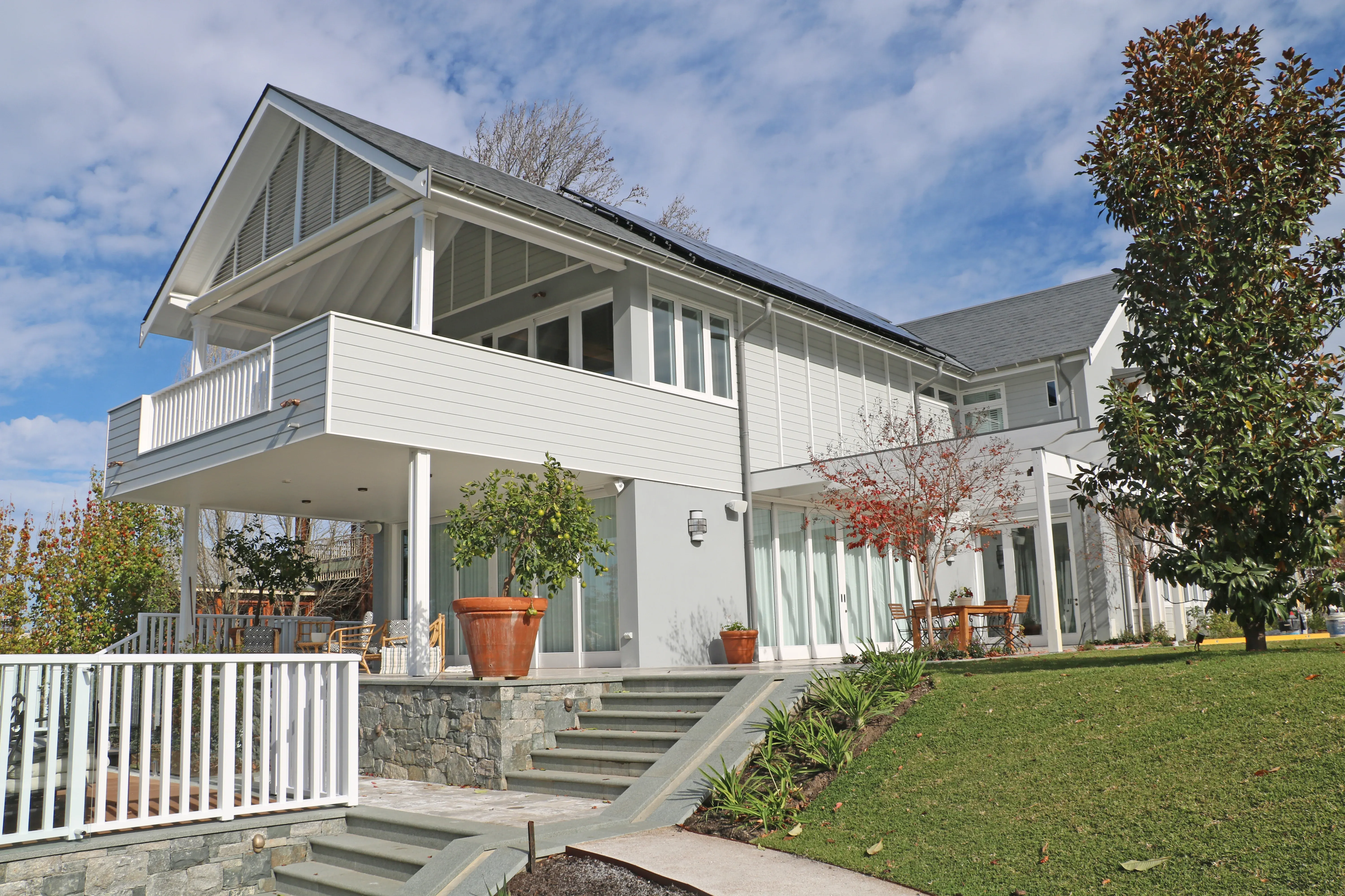
Whether you’re choosing wall colours for your home or office, you’re responsible for setting the mood in a space you’ll share with others. Here are 5 “Do’s and Don’ts” to picking paint colours that help take the pressure off, and ensure your choice is one you’ll be proud of.
DO: Consider what mood you’d like to create, and work from there
The jury’s out on the science of how, but there’s no doubt that colour affects how we feel in some way. Whether you’re at home or in the office, consider the function of each room/area and what mood you’d like to create to support that function. Then build your colour scheme around the hue that best evokes that mood. Cool colours, for example, are known to boost concentration. This makes them great for an office or study. Using a shade of blue as your base (which often means this will be your wall colour), you can accent with warmer tones to create a room that boosts focus without becoming too melancholy. Decor and accessories that add a splash of red, orange, pink or yellow often do the trick against blue walls.
DO: Use your brand identity as a foundation
This is especially true for businesses, but can be an equally useful concept at home, if you simply leave out the word “brand”. Practically, it’s best to start your colour coordination plans in your office or reception area — this is where your brand personality will be most visible. If you’re choosing for a commercial space, logos, corporate colours and the company website are a great starting point. Work with them freely, though — if the corporate colours are too bold to use as wall colour, choose a complementary, softer colour for the walls and accent with brand colours through things like decor, fixtures, and trim.
DON’T: Randomly mix and match colours
Experimenting is a good thing, but do so before you lift a paintbrush to your walls! Use a colour wheel, representing the relationships between colours, to find out which hues, shades and tones you can expect to work well together and which combinations you should avoid. A colour picker tool can go one step further, by helping you see what available paint colours could look like on your walls. To make it that much easier, Barker-Whittle’s colour picker lets you see a pick of 3 classic colours in various contexts as a starting point. These colours are guaranteed to make an impression, and remain an everfresh canvas for your seasonal style updates.
DO: Consider everything else in the room (and the rooms next door!)
Light, and context in general, changes the way paint looks in a space. A large wall painted in a bold colour may seem overpowering in the bright lights of a nearby window, but warm up a space with indirect light as an accent wall. And like light, furniture and the neighbouring rooms also have an influence on how wall colour is received. It helps to think about your visual field as the frame of an art composition. Standing in one room, you’ll see the wall, floors, all the furniture and decor, and a piece of the room next door (e.g. through the door). Considering how this works as a whole can help you make decisions about which colours work best, and which are best avoided.
TIP: Use a lightbox in store to test paint chips under various lighting conditions.
DO: Be aware of your neighbourhood
Self-expression is important, and often undervalued, but painting your home or office exterior is one place you’re better of blending in. Limit living with painters’ regret by choosing an exterior paint colour that complements your surroundings. Keep an eye on the finer details as well, so you know the limits of your creative expression. You could, for instance, keep a building from looking oversized by painting it a darker colour, or choose a paint that complements your landscaping. Remember that the colour of your driveways and walkways may also need to be considered.
If you’re choosing colours for an office space, you may want to enlist the help of commercial painters. Or, if you’re updating your home, a home painting service should be more than happy to advise you on which colour ideas are more practical given your space. Luckily, Barker-Whittle does both! For more than 40 years, we’ve been offering advice on choosing colour palettes to suit taste and budget. We’d be happy to recommend classic, long-lasting, elegant looks, and even get the painting done while you’re away. Request a free, no obligation quote for a hassle-free colour update that will be done to budget and deadline.


